Embracing Autumn campaigns without cheapening your brand
Autumn gives a rich sensory trigger: warm light, cosy textures, falling leaves, pumpkin spice vibes. For luxury home interiors, the tricky part is evoking that season without leaning into cliché or novelty.

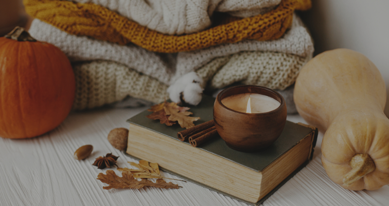
The magic in evoking autumn without leaning into clichés, is to use just enough autumn cues so your core brand message remains front-and-centre. If the seasonal theme overtakes your brand identity, it starts to feel like a cheap seasonal gimmick.
But copywriting also plays a key role.
Using a tone aligned with your brand (elegant, calm, refined), you can weave seasonal references (“autumn glow,” “harvest warmth,” “hearth light”) without losing your usual register. The clearer your voice, the less explanation you need, which helps maintain luxury positioning. In this entry, we’ll break down the different approaches you can take to embrace this season without cheapening your brand.
Autumnal colour palettes & their temporary use
Do you remember the recent Taylor Swift album announcement? Suddenly many social media feeds turned glitter orange, with brands centering their imagery and posts on including as much of it as possible. The problem is the connection to their brand was missing 80% of the time.
Here are some hex code palettes that give cosy pumpkin spice & autumn vibes, without screaming Halloween. These are great for accent shifts: small parts of your marketing, not your full brand suite.
Warm Pumpkin Spice + Earthy Neutrals

Harvest Gold + Rustic Accent
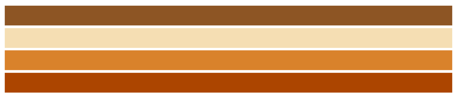
You can use these colours in subtle ways:
- Accent items (pillows, throws, small décor pieces in images)
- Social media visuals: backgrounds or overlays in autumn tones while keeping your main product photos in your usual neutral branding
- Limited edit campaigns or one off visuals (e.g. “Autumn Edit”, “Harvest Collection”) rather than rebrand everything
Let’s check back in with Burberry
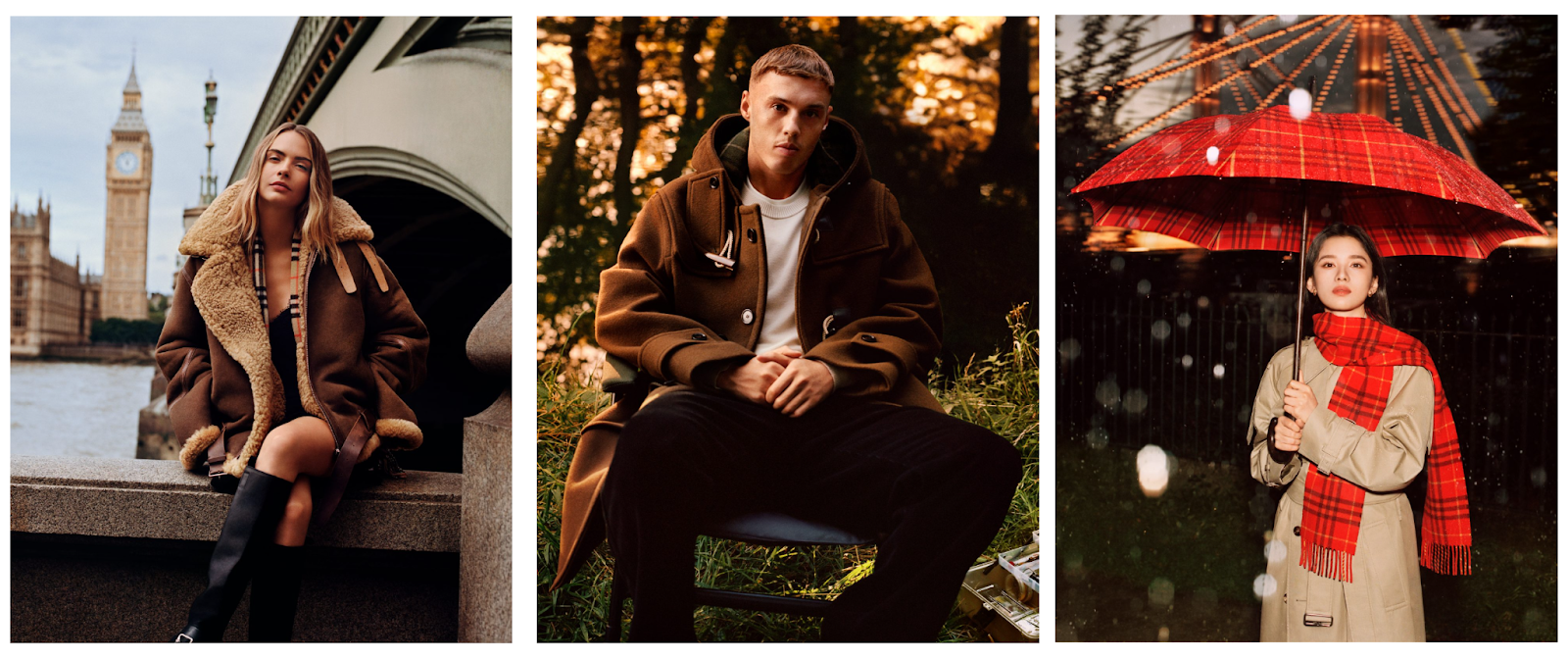
Back in October of 2024, Burberry perfectly showcased how to incorporate the Autumnal themes without letting them take over the brand. Burberry brought out the best when it came to casting with names like Olivia Coleman and Barry Keoghan. The key in their campaigns was the focus on warm hues in their imagery, then cosy warm clothing items chosen for the actors in the videos. When this time of year comes around, they know everyone is thinking about whether their coats will stand up to the weather.
With the heritage of Burberry being British, it makes sense that they understood both the feelings of consumers at this time, as well as the crossover between cosy autumnal themes and the quality of their products. They let their brand shine by using good storyboarding and actors to make their coats the stars of their ‘It’s always Burberry weather’ campaign. The results? A modern refreshing autumnal take on a classical British heritage brand.
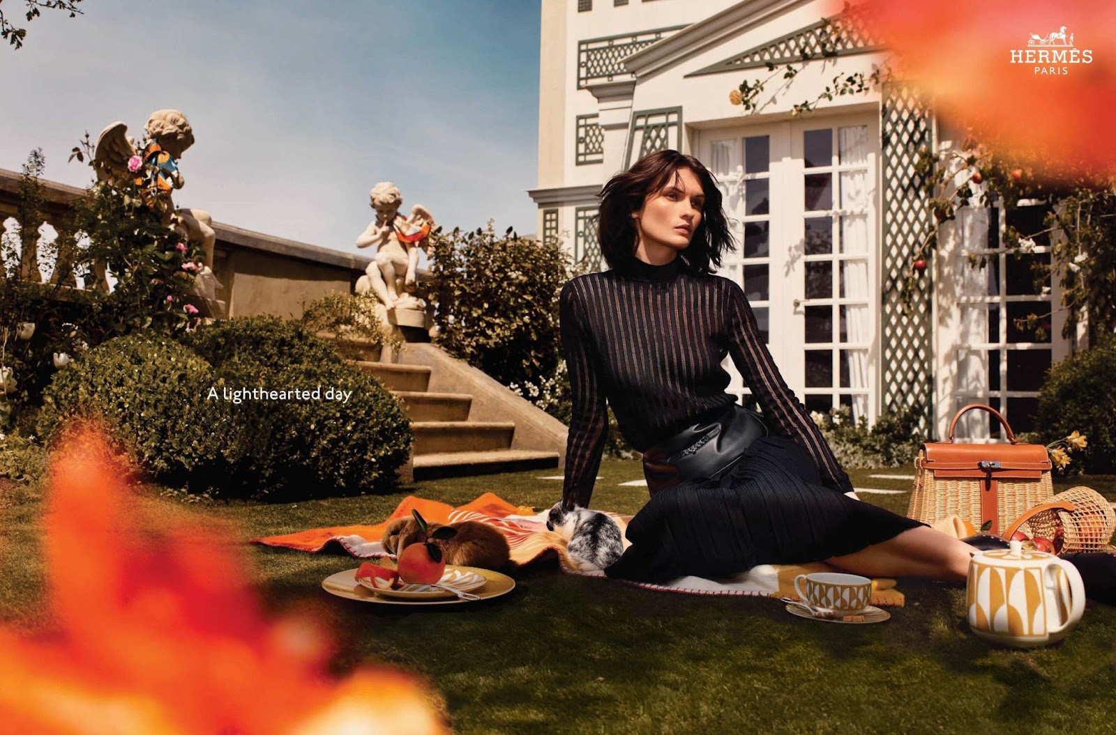
If I were visually advising a luxury home interior brand today, here’s some tips I’d give to embrace autumn.
- Roll out a small seasonal edit of 3-5 décor pieces in an autumnal hue (#ac4500) paired with off-white (#e4d9c5) and green ochre (#9f8f55) as complementary accents. This colour balance can be used to make sure the colours of Autumn/Halloween don’t overtake the brand.
- Launch a campaign with visuals that emphasise texture and light: wool, linen, driftwood, candlelight, but keep your core product finishes consistent (metals, woods) as usual. If you suddenly pivot to pumpkins outside of doors, everything orange it will feel forced and off-brand.
Final thoughts
In the end, embracing autumn in your marketing is less about pumpkins and puns, and more about balance.
With the right palette, thoughtful copy, and a clear link back to your brand identity, you can capture the warmth of the season without losing your luxury edge.
Subtlety is what makes the seasonal shift feel timeless.

%20(51).png)
%20(50).png)
%20(49).png)